The practical answer
Your cover photo is the image that has to win attention before your title, amenities, and reviews get a fair read. If it is dim, cramped, vertical, or confusing, a guest may never open the listing.
Airbnb-specific context
Airbnb's photo-tour guidance says the first photo is the large image that appears in search, and the first five photos are especially important on the listing. That means the cover photo should not be selected casually. It is the top of the funnel for the listing.
What the cover photo needs to communicate
The cover should answer one question: why should a guest click this listing instead of the next one? That answer might be a bright living room, a clean bedroom, a balcony view, a pool, a workspace, a charming exterior, or a standout amenity. The image should still be honest and current.
Common cover photo mistakes
Avoid vertical photos, wide-angle distortion that makes the room look fake, dark images, over-filtered colors, collages, text overlays, and shots where the main selling point is too small to see. At search-result size, simplicity wins.
A better workflow
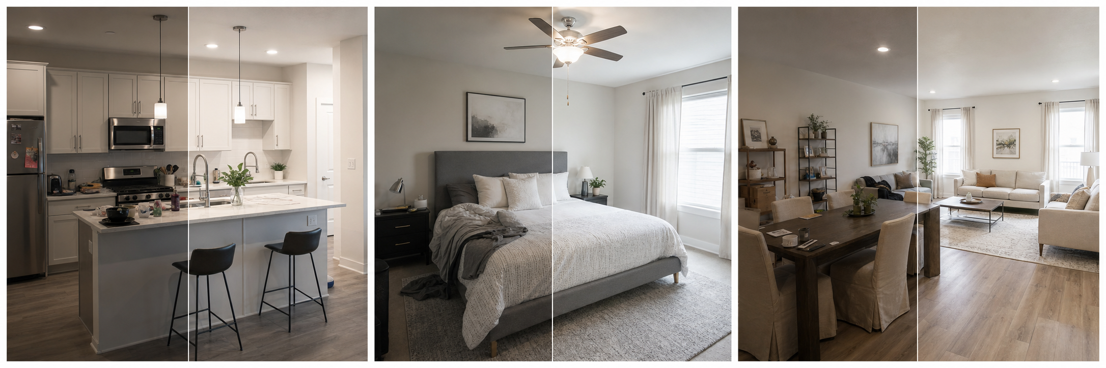
Pick three cover candidates and view them at thumbnail size. Choose the one that stays clear when small, shows a meaningful feature, and matches the guest expectation you want to set. Then use the next four photos to support the story: sleeping, bathing, cooking, relaxing, and the unique amenity.
FAQ
What makes a good Airbnb cover photo?
A good cover photo is landscape-oriented, bright, uncluttered, and focused on the most compelling part of the stay.
Should the cover photo show the exterior or interior?
Use the image that best explains the value of the stay. For many listings that is the main living area, view, pool, bedroom, or exterior feature guests are likely to choose you for.
Sources
- Airbnb Help Center: Taking great photos of your listing
- Airbnb Help Center: Setting up a photo tour for your home listing
- Airbnb Help Center: Add visual descriptions to photos in your listing
- Airbnb Help Center: Confirming photo accuracy for listings
- Airbnb Help Center: Offer for free Airbnb photography
- Google Business Profile
- Google Business Profile Help: Manage your hotel's details
- Booking.com Partner Hub: Understanding photo requirements for your property
- Booking.com Partner Hub: Improve visibility and ranking
- Vrbo Help: Photo guidelines
- Zillow Rental Manager Help: Photo Uploading Tips
- Zillow Rental Manager: Post a listing